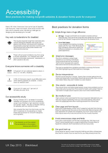
Kudos to npENGAGE for their post last week on nonprofit websites. As someone who routinely works with nonprofits, websites are often a concern for nonprofit leaders. Does it represent our mission? Is it easy to use? Do you think we need to do something different? These are some of the type of questions that are often asked. And the truth is many times the answers are No. No. Yes. But by understanding some primary issues with many websites you can make some adjustments that will prove to be very beneficial. (The following results are based on a study by Brandon Granger of Blackbaud and technologist, Darin Cavanaugh conducted in early 2014.)
Here is a distillation of the npENGAGE post. I recommend you read it in full here.
#1 Pay Attention to Color
Whether you know it or not, your color palette matters. For those who are color blind or have difficulty picking out reds, a hyperlink is just a black piece of text. For those who have to wear glasses text size and fonts matter a lot.

#2 Page Layout Matters
Your layout of how to use your site will determine whether people stay around or move on with their philanthropic lives. Pay attention to communication flow and how you organize your menus. If your ‘Donation’ Call-to-Action is simply a link buried in your navigation don’t be surprised if your online giving is low.
#3 Simple Donation Forms are Better
How much data to you really need to allow someone to give you money? Do you really care about their “Title”. Also, if you make someone jump through too many clicks it becomes a chore to GIVE YOU MONEY. With all the competition for donation dollars, there is no need to work against yourself.
#4 Design: Less is More
“Visual and information noise can be a killer. Too much text, too many colors, too many options. Noise often forced our test donors to “learn” websites instead of just using them.” Focus on the needs of your donors/members first, then everyone else. Communication dumps on your homepage will work against you.
#5 Keep Mobile Layout a Priority
Responsive designs are VERY important. You may have a great website, but if potential donors or volunteers cannot view it via their tablet or smartphone it becomes cumbersome to utilize. Let’s face it, ease of use is a key metric in today’s portable culture.
If you want to read the fuller article posted by npENGAGE, just click here. For a printable quick reference, also developed by the sponsors of the study .